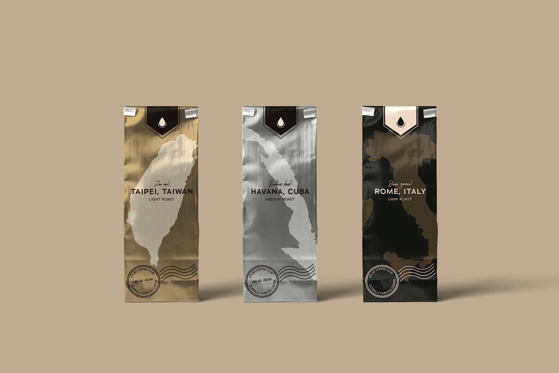
Starting with color, I drew inspiration from different roasts of coffee to create a smooth, warm, rich gradient of browns. This range of color options could work on multiple displays and packaging without interfering with their diverse designs.

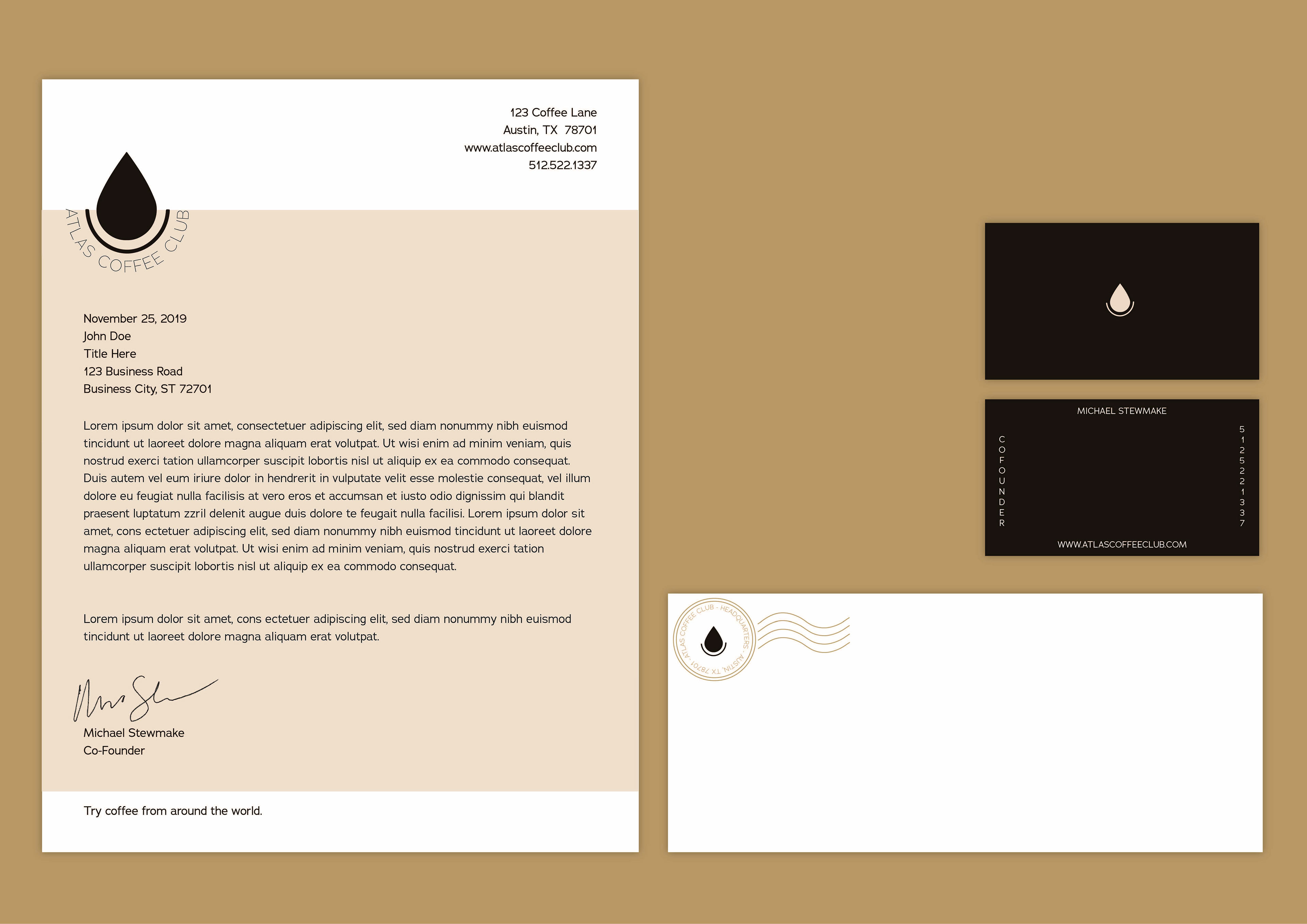
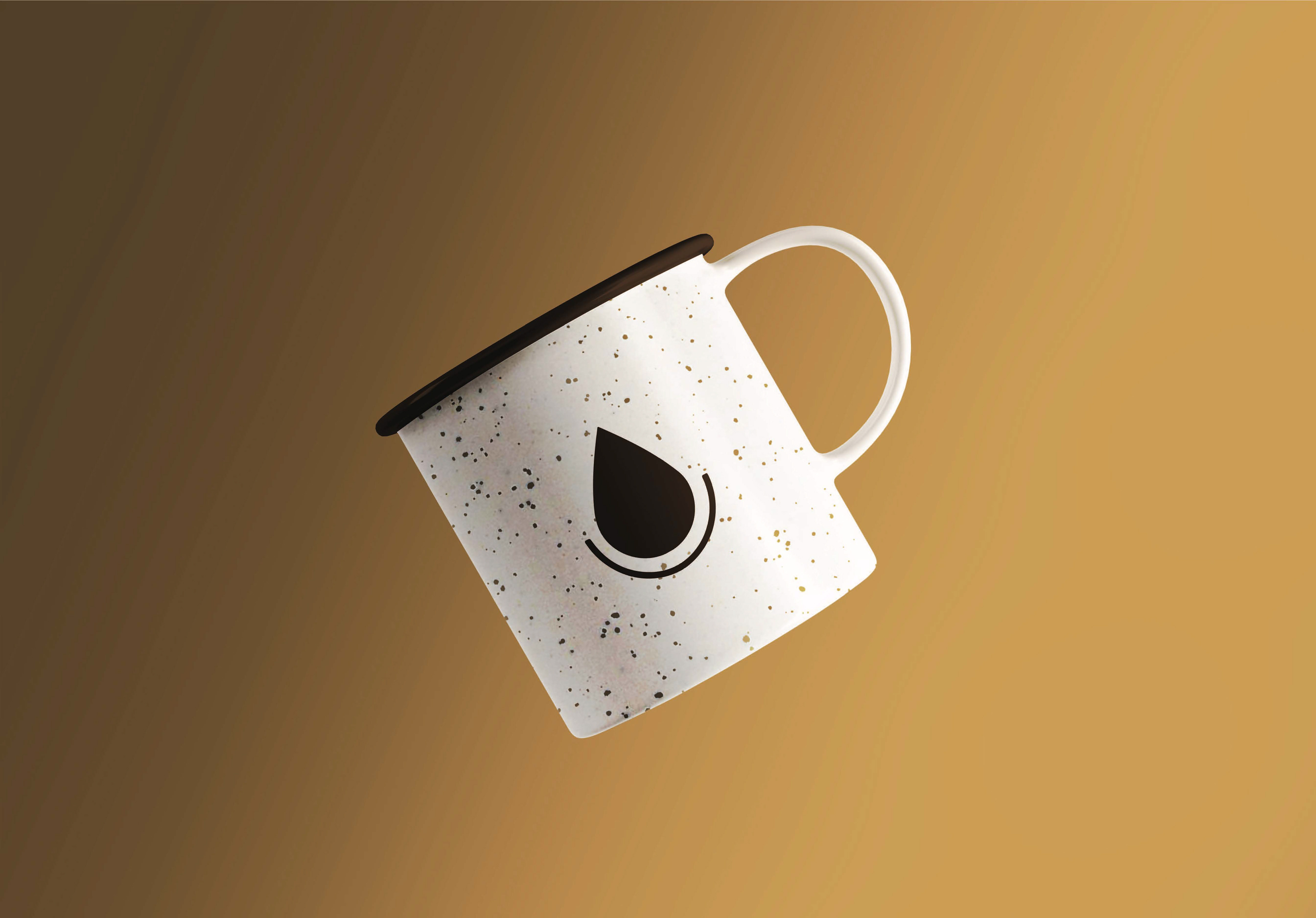
The logo was inspired by a beacon on a compass, pointing ahead towards the next destination, while simultaneously being a drop of coffee in a mug. I narrowed down the color options to a clean and fresh palette, paired with type to create a brand identity. I envisioned the gourmet coffee to be packaged in slick, metallic bags, encased in hard shell boxes to showcase the maps and passport stamps of the locations the coffee was roasted in. The brand identity is completed with letter-head, mugs, K-cups, and cold brew bottles.


Although this was not commissioned by Atlas Coffee Company, this was such a fun project to experiment with packaging, brand identity and my love for coffee!