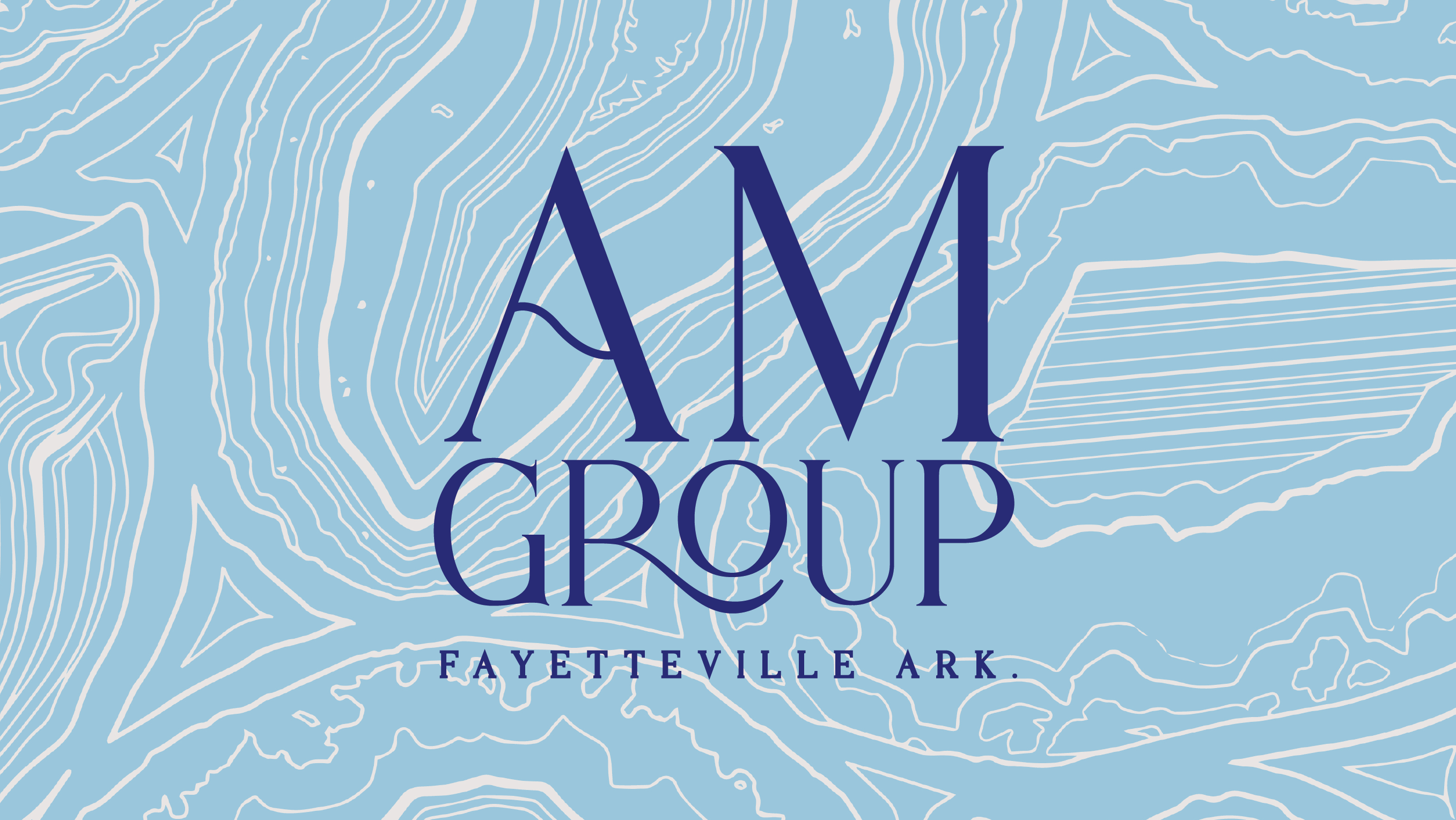
The Brief
I designed a custom experimental typeface inspired by fluid motion, electronic music culture, and psychedelic visual language. The project explored how typography could capture the feeling of movement and freedom often associated with music festival environments.
I designed a custom experimental typeface inspired by fluid motion, electronic music culture, and psychedelic visual language. The project explored how typography could capture the feeling of movement and freedom often associated with music festival environments.
The Problem
Many display typefaces emphasize structure and legibility but rarely attempt to visually represent motion and fluidity. I wanted to experiment with how letterforms could embody movement while still functioning as a cohesive typographic system. The challenge was balancing expressive, organic forms with the consistency required for a complete alphabet, numbers, and punctuation set.
Many display typefaces emphasize structure and legibility but rarely attempt to visually represent motion and fluidity. I wanted to experiment with how letterforms could embody movement while still functioning as a cohesive typographic system. The challenge was balancing expressive, organic forms with the consistency required for a complete alphabet, numbers, and punctuation set.

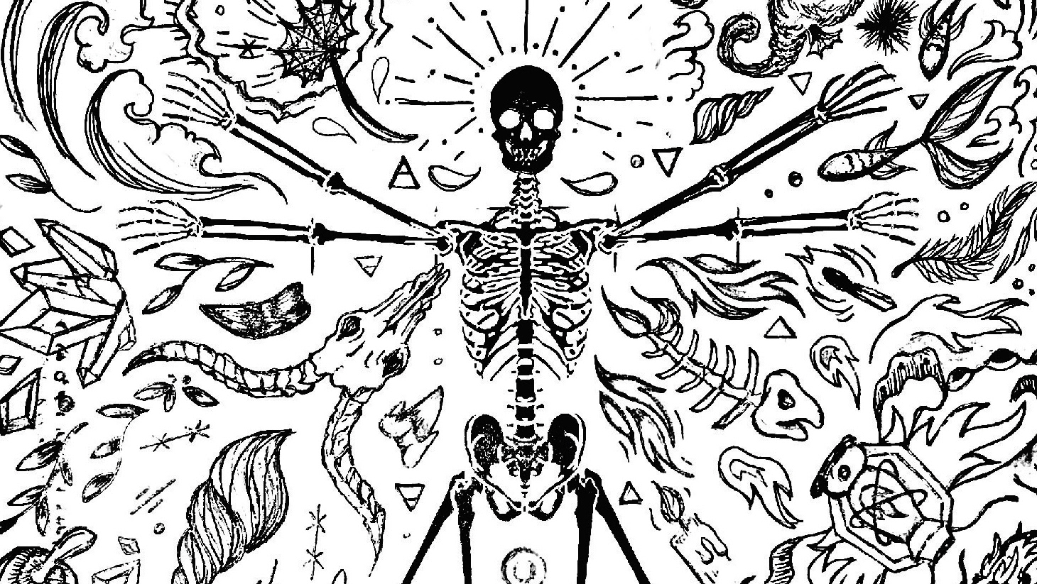
Insight
Fluid natural forms—such as water droplets, oil spills, and reflective surfaces—share visual qualities that translate well into dynamic letterforms. By studying these patterns, typography could take on an almost liquid-like behavior while still maintaining recognizable shapes.
Fluid natural forms—such as water droplets, oil spills, and reflective surfaces—share visual qualities that translate well into dynamic letterforms. By studying these patterns, typography could take on an almost liquid-like behavior while still maintaining recognizable shapes.
Design Intent
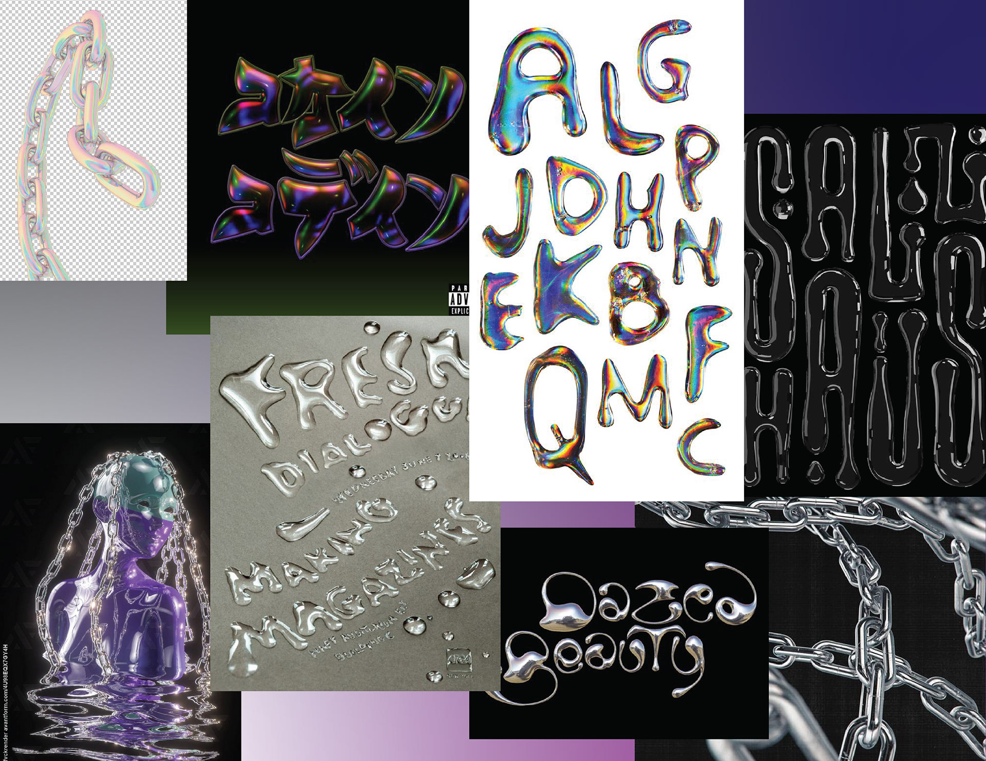
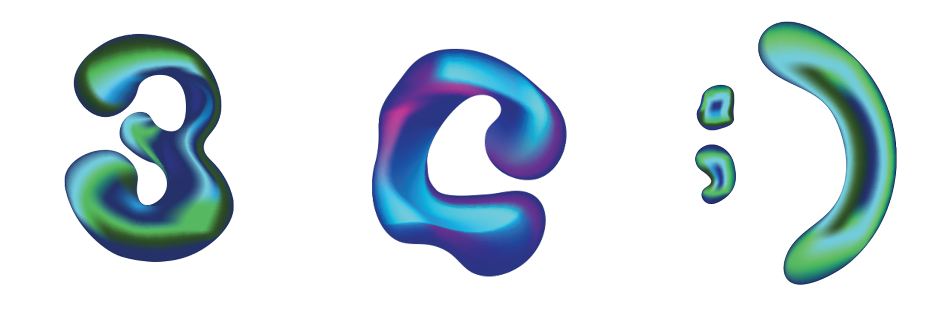
I began with a visual mood board referencing liquid textures, chain links, oil slicks, and fluid-inspired typography. From there, I sketched droplet-based letterforms by hand before refining them digitally in Adobe Illustrator to build a complete vector typeface. Using Fontself Maker, I converted the design into an open-source font. Each letter was given a unique gradient mesh pattern to simulate movement and reflection, while numbers and punctuation incorporated cooler green tones to create contrast within longer compositions.
I began with a visual mood board referencing liquid textures, chain links, oil slicks, and fluid-inspired typography. From there, I sketched droplet-based letterforms by hand before refining them digitally in Adobe Illustrator to build a complete vector typeface. Using Fontself Maker, I converted the design into an open-source font. Each letter was given a unique gradient mesh pattern to simulate movement and reflection, while numbers and punctuation incorporated cooler green tones to create contrast within longer compositions.
Outcome
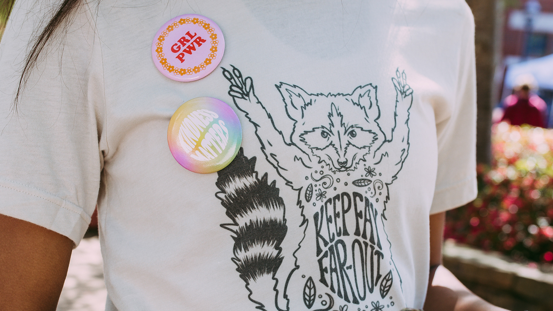
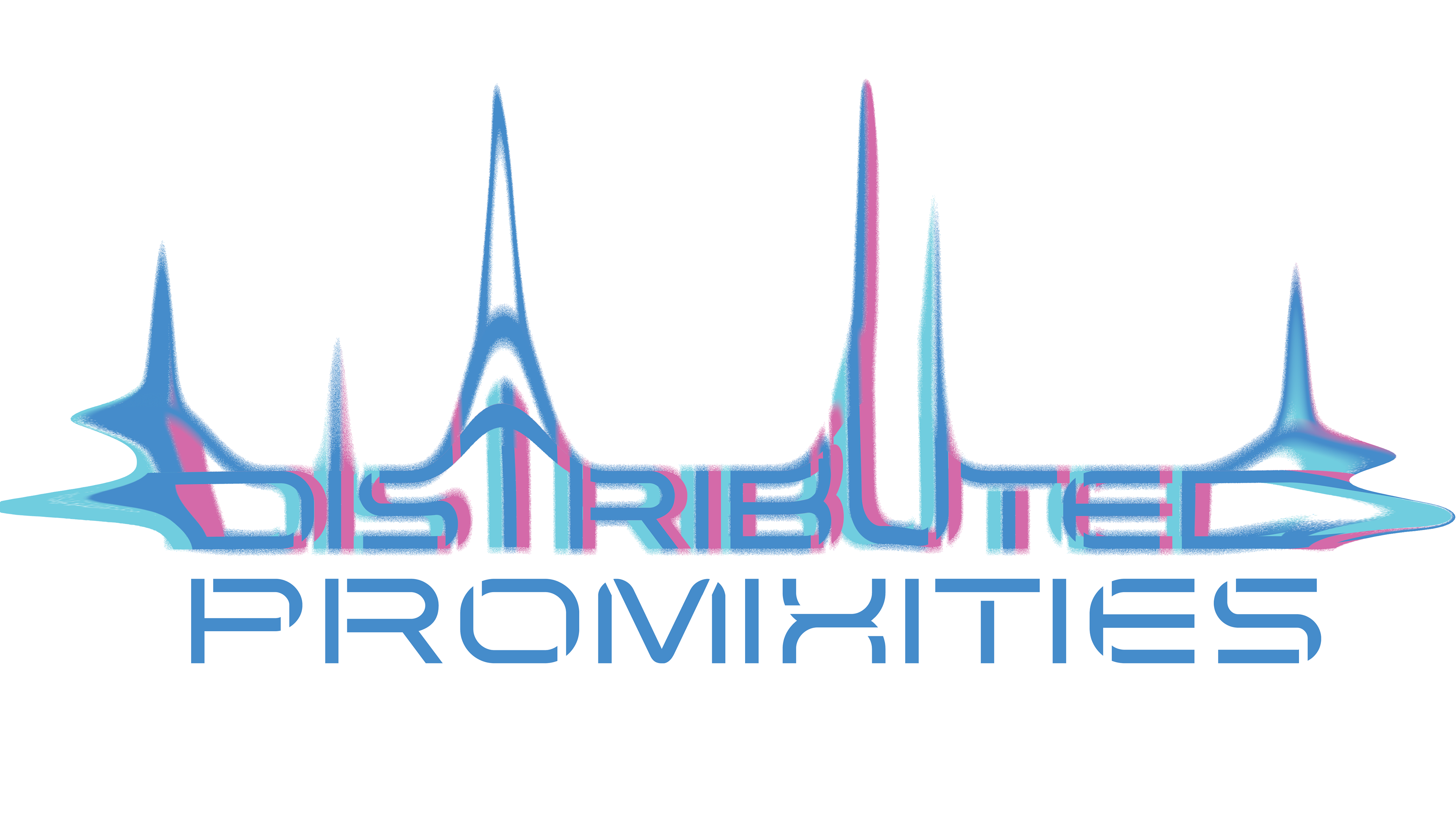
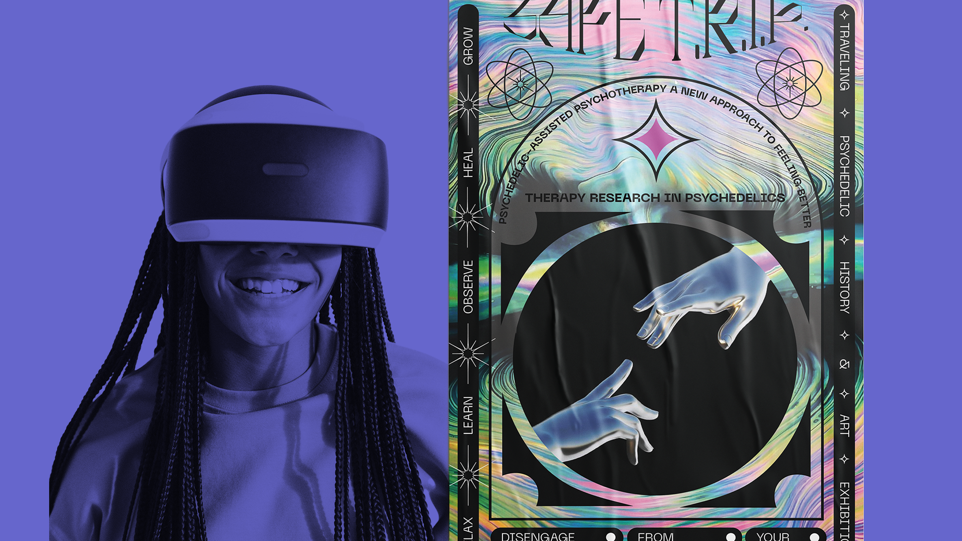
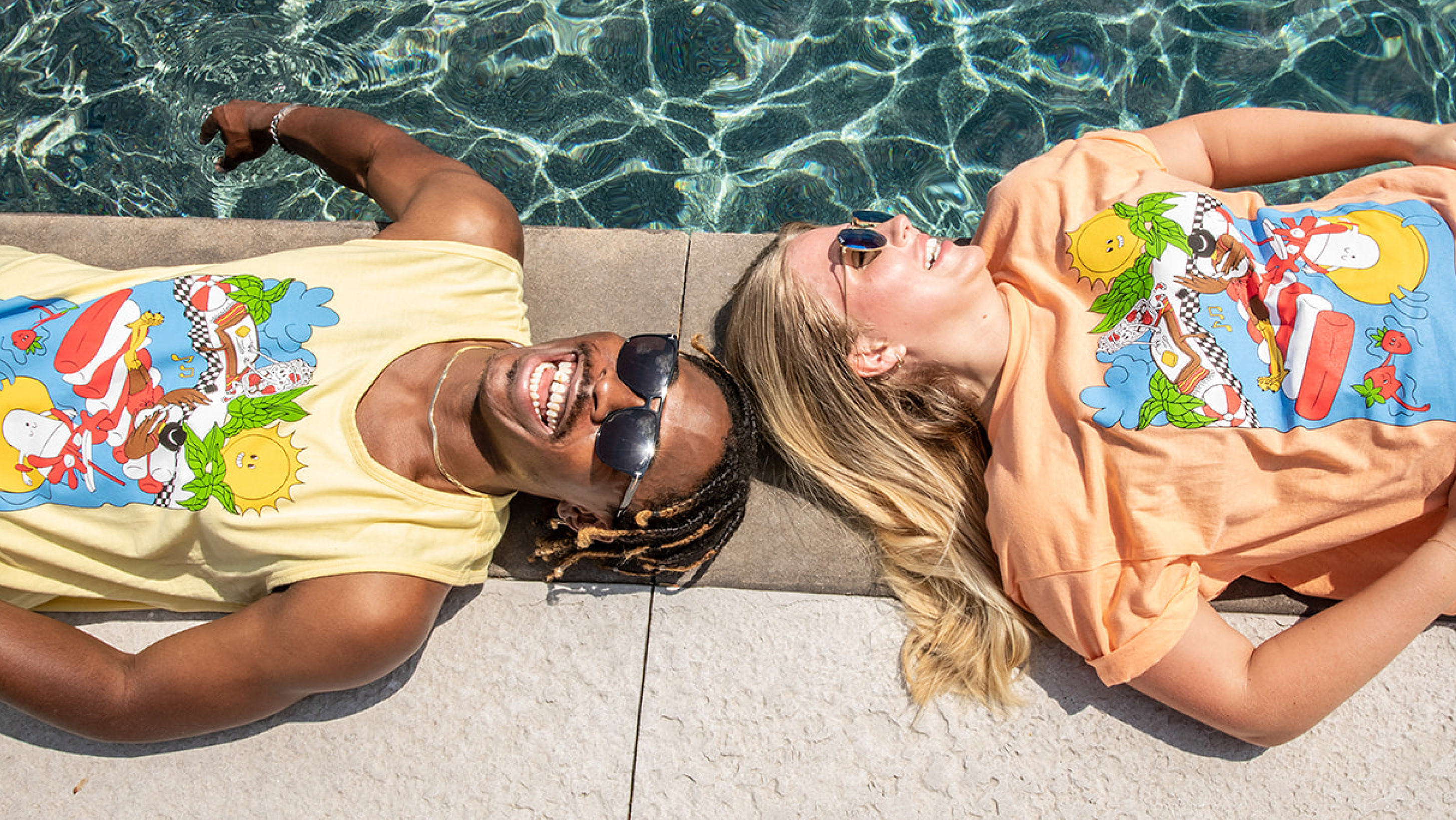
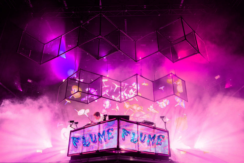
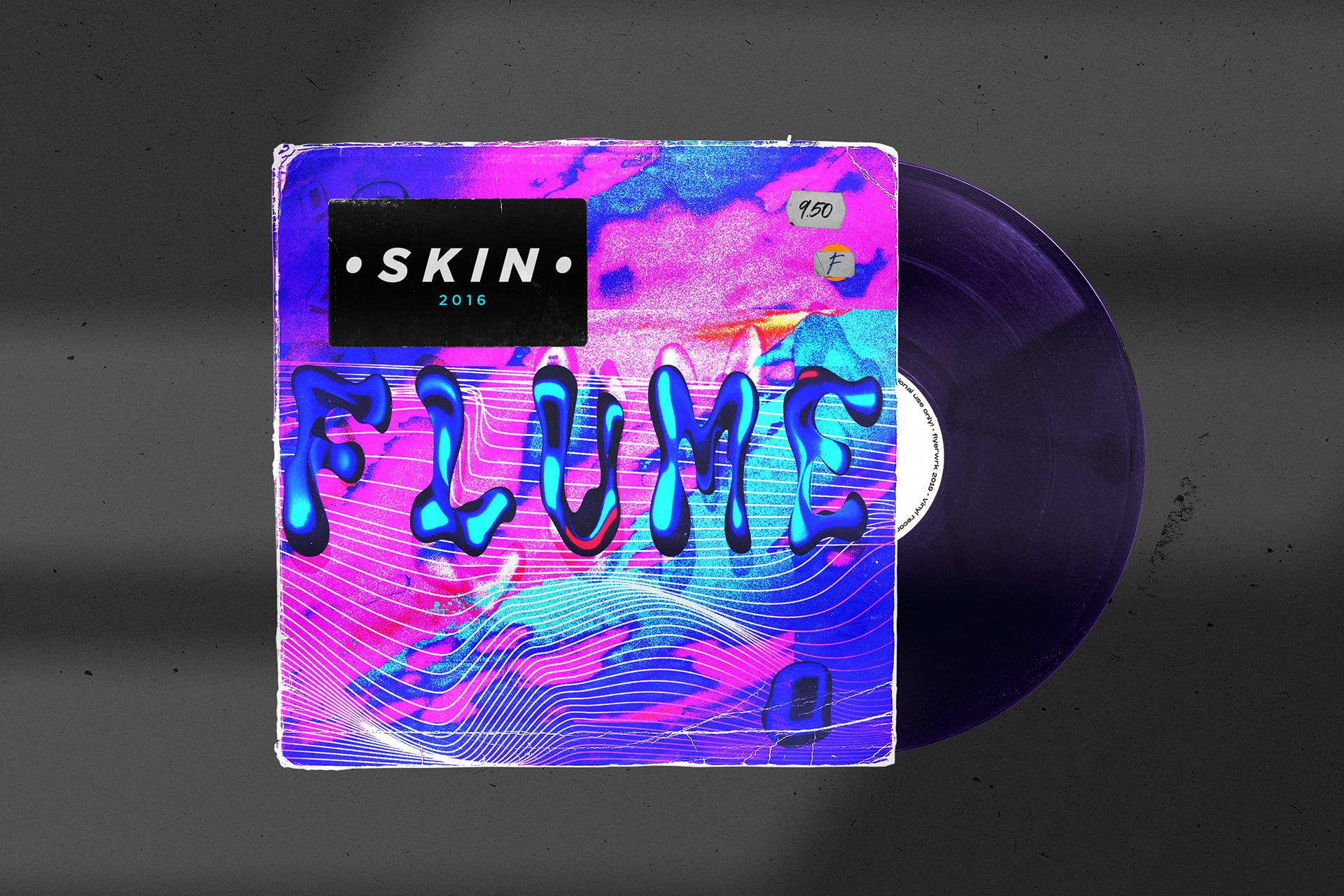
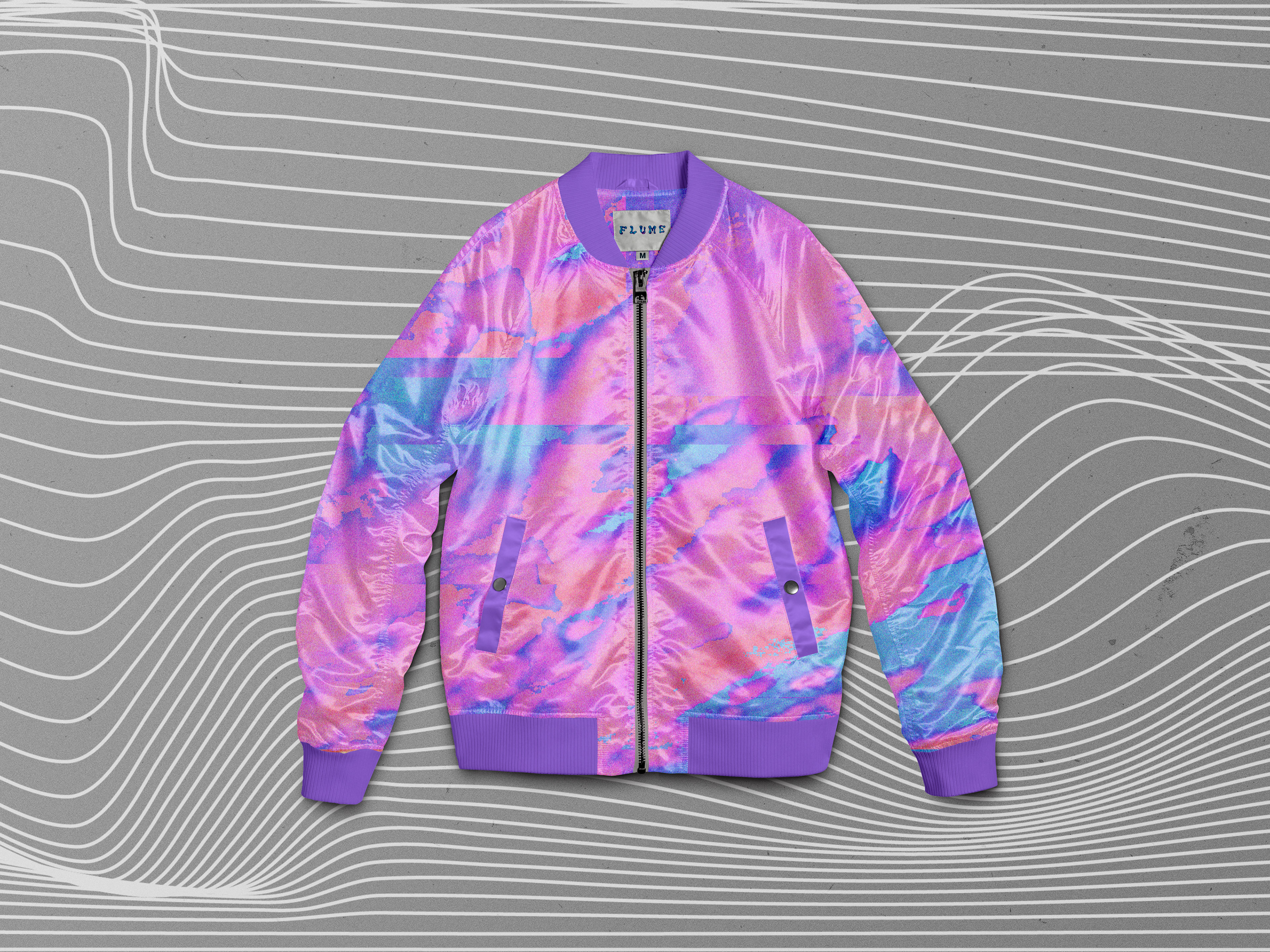
The final typeface functions as a vibrant display font inspired by music culture and psychedelic aesthetics. To explore potential applications, I developed conceptual branding inspired by the electronic artist Flume, applying the typeface to experimental album artwork and apparel graphics.
The final typeface functions as a vibrant display font inspired by music culture and psychedelic aesthetics. To explore potential applications, I developed conceptual branding inspired by the electronic artist Flume, applying the typeface to experimental album artwork and apparel graphics.