
Focusing on the HMW question; How might we make campus life more manageable, enjoyable, & productive for senior art and design students? I explored the limitations of data. What are the limitations of data with respect to providing a full story to our audiences? How does data aggregation shape our perception about audiences/communities? In what ways can human-centered design create a more holistic understanding of our audiences?
Each student in my class tracked 4-5 personal data sets on a daily basis related to quantitative and qualitative content–then traded data with another student, keeping the source anonymous. After going through the data, I made insights on how the data sets correlated with one another and made an argument to visualize through the presented data.
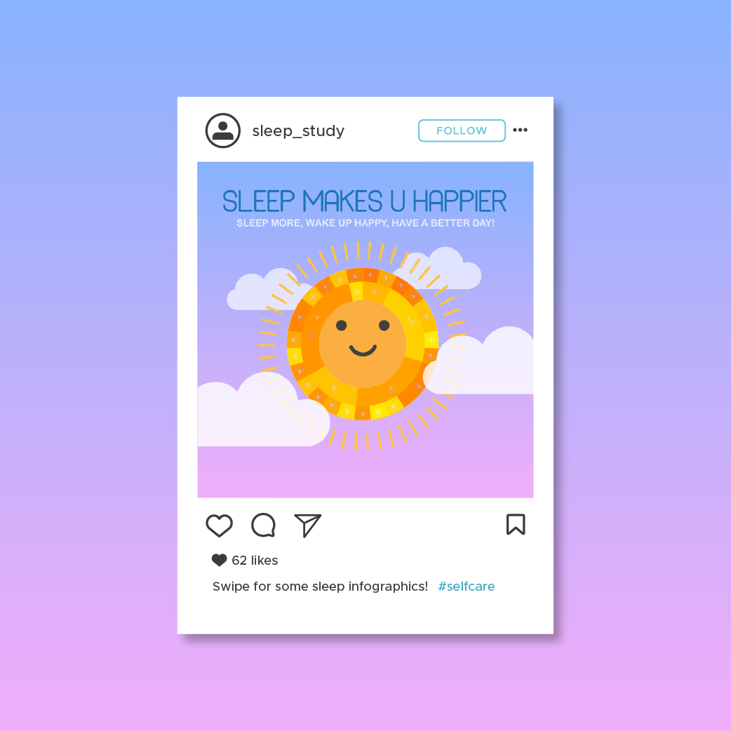
In the first round of data visualization, I created a progressing Instagram post and I intentionally left out data to make my argument stronger. This showed how easily data can be screwed to make your specific standing point true. This is not the correct way of showing data, especially if the data you collected is only from one source.
In the second iteration of data visualization, I designed a 14 page zine with a light-hearted, playful tone that would hopefully capture the audiences attention. I intentionally included lots of colorful illustrations and made it quite small so it feels more special and makes the reader take their time digesting the information. I included the data I had originally left out and confessed to making assumptions about this person that may or may not be true.
This project was a little bit out of my comfort zone because I normally don't focus on data leading a project, but I really enjoyed the process and think the outcome is super fun. This project shows just how easily data can be manipulated and skewed to present a desired argument.